


AndroidBottomBar
???? A lightweight bottom navigation view, fully customizable with an indicator and animations.


Including in your project
Gradle
Add below codes to your root build.gradle file (not your module build.gradle file).
allprojects {
    repositories {
        mavenCentral()
    }
}
And add a dependency code to your module's build.gradle file.
dependencies {
    implementation "com.github.skydoves:androidbottombar:1.0.2"
}
Usage
Add following XML namespace inside your XML layout file.
xmlns:app="http://schemas.android.com/apk/res-auto"AndroidBottomBarView
Here is a basic example of implementing AndroidBottomBarView.
<com.skydoves.androidbottombar.AndroidBottomBarView
android:layout_width="match_parent"
android:layout_height="64dp"
android:background="@color/colorPrimary"
app:bottomBar_duration="300" // duration of the menu animation.
app:bottomBar_flavor="icon" // decides which type (icon, title) will be shown as default.
app:bottomBar_indicator_color="@color/md_blue_200" // color of the indicator.
app:bottomBar_indicator_height="4dp" // height size of the indicator.
app:bottomBar_indicator_padding="6dp" // left and right padding of the indicator.
app:bottomBar_indicator_radius="12dp" // corner radius of the indicator.
app:bottomBar_indicator_visible="true" // visibility of the indicator.
app:bottomBar_menuAnimation="overshoot" // animations for selected or unselected menu item.
app:bottomBar_selectedIndex="1" // preselected index when initialized.
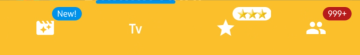
/>BottomMenuItem
We can add menu items to the AndroidBottomBarView using the BottomMenuItem, fully customizable.
androidBottomBar.addBottomMenuItems(mutableListOf(
      BottomMenuItem(this)
        .setTitle("Movie") // sets the content of the title.
        .setTitleColorRes(R.color.black) // sets the color of the title using resource.
        .setTitleActiveColorRes(R.color.white) // sets the color of the title when selected/active.
        .setTitlePadding(6) // sets the padding of the title.
        .setTitleSize(14f) // sets the size of the title.
        .setTitleGravity(Gravity.CENTER) // sets gravity of the title.
        .setIcon(R.drawable.ic_movie)
        .setIconColorRes(R.color.md_blue_200) // sets the [Drawable] of the icon using resource.
        .setIconActiveColorRes(R.color.md_blue_200) // sets the color of the icon when selected/active.
        .setBadgeText("New!") // sets the content of the badge.
        .setBadgeTextSize(9f) // sets the size of the badge.
        .setBadgeTextColorRes(R.color.white) // sets the text color of the badge using resource.
        .setBadgeColorRes(R.color.md_blue_200) // sets the color of the badge using resource.
        .setBadgeAnimation(BadgeAnimation.FADE) // sets an animation of the badge.
        .setBadgeDuration(450) // sets a duration of the badge.
        .build(),

      BottomMenuItem(this)
      // .. //
Here is the Java way.
List<BottomMenuItem> bottomMenuItems = new ArrayList<>();
bottomMenuItems.add(new BottomMenuItem(context)
    .setTitle("Tv")
    .setIcon(R.drawable.ic_tv)
    .build());
// add more BottomMenuItems. //
androidBottomBarView.addBottomMenuItems(bottomMenuItems);
BottomBarFlavor
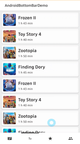
BottomBarFlavor decides which type (icon, title) will be shown as default (if unselected).
The default flavor is icon.
app:bottomBar_flavor="icon"| ICON | TITLE |
|---|---|
 |  |
Indicator
We can customize the indicator using below attributes.
app:bottomBar_indicator_color="@color/md_blue_200" // color of the indicator.
app:bottomBar_indicator_height="4dp" // height of the indicator.
app:bottomBar_indicator_padding="6dp" // padding of the indicator.
app:bottomBar_indicator_radius="12dp" // corner radius of the indicator.
app:bottomBar_indicator_visible="true" // visibility of the indicator.
Title Composition
We can customize the title of the menu item.
.setTitle("Movie") // sets the content of the title.
.setTitleColorRes(R.color.black) // sets the color of the title using resource.
.setTitleActiveColorRes(R.color.white) // sets the color of the title when selected/active.
.setTitlePadding(6) // sets the padding of the title.
.setTitleSize(14f) // sets the size of the title.
.setTitleGravity(Gravity.CENTER) // sets gravity of the title.
TitleForm
TitleForm is a collection of attribute class that related to a menu title for customizing the menu item title easily.
Generally, we set the almost same attributes for consistency of the menu items.
We can build a common form of the title, and we can reuse on every menu item.
Then we can reduce boilerplate work from writing the same attributes on every menu item.
// we can create the form using kotlin dsl.
val titleForm = titleForm(this) {
  setTitleColorRes(R.color.black)
  setTitlePadding(6)
  setTitleSize(14f)
}

 androidBottomBar.addBottomMenuItems(mutableListOf(
      BottomMenuItem(this)
        // setTitleForm must be called before other title related methods.
        .setTitleForm(titleForm)
        .setTitle("Movie")
        .build(),

      BottomMenuItem(this)
        .setTitleForm(titleForm)
        .setTitle("Tv")
        .build(),
     // ** //
Here is the Java way to build the TitleForm.
TitleForm.Builder titleForm = new TitleForm.Builder(context)
    .setTitleColorRes(R.color.black)
    .setTitlePadding(6)
    .setTitleSize(14f);
Icon Composition
We can customize the icon of the menu item.
.setIcon(R.drawable.ic_movie)
.setIconColorRes(R.color.md_blue_200) // sets the [Drawable] of the icon using resource.
.setIconActiveColorRes(R.color.md_blue_200) // sets the color of the icon when selected/active.
.setIconSize(24) // sets the size of the icon.
IconForm
IconForm is a collection of attribute class that related to a menu icon for customizing the menu item icon easily.
The same concept of the TitleForm, and we must call before other icon related methods.
// we can create the form using kotlin dsl.
val iconForm = iconForm(this) {
  setIcon(R.drawable.ic_movie)
  setIconColorRes(R.color.md_blue_200) // sets the [Drawable] of the icon using resource.
  setIconSize(24) // sets the size of the icon.
}

androidBottomBar.addBottomMenuItems(mutableListOf(
      BottomMenuItem(this)
        .setIconForm(iconForm)
        .setIcon(R.drawable.ic_star)
        .build(),
        // ** //
Here is the Java way to build the IconForm.
IconForm.Builder iconForm = new IconForm.Builder(context)
        .setIconColorRes(R.color.md_blue_100)
        .setIconSize(24);
Badge Composition
We can customize the badge of the menu item.
.setBadgeText("New!") // sets the content of the badge.
.setBadgeTextSize(9f) // sets the size of the badge.
.setBadgeTextColorRes(R.color.white) // sets the text color of the badge using resource.
.setBadgeColorRes(R.color.md_blue_200) // sets the color of the badge using resource.
.setBadgeStyle(Typeface.BOLD)// sets the [Typeface] of the badge.
.setBadgePadding(6) // sets the padding of the badge.
.setBadgeMargin(4) // sets the margin of the badge.
.setBadgeRadius(6) // sets the radius of the badge.
.setBadgeAnimation(BadgeAnimation.FADE) // sets an animation of the badge.
.setBadgeDuration(450) // sets a duration of the badge.
Show and dismiss
We can show and dismiss badges using below methods.
androidBottomBar.showBadge(0) // shows the badge by an index.
androidBottomBar.showBadge(0, "123") // shows the badge by an index and changes badge text.
androidBottomBar.dismissBadge(0) // dismisses the badge by an index.
BadgeForm
BadgeForm is a collection of attribute class that related to a menu badge for customizing the menu item badge easily.
The same concept of the TitleForm, and we must call before other badge related methods.
// we can create the form using kotlin dsl.
val badgeForm = badgeForm(this) {
  setBadgeTextSize(9f)
  setBadgePaddingLeft(6)
  setBadgePaddingRight(6)
  setBadgeDuration(550)
}

androidBottomBar.addBottomMenuItems(mutableListOf(
      BottomMenuItem(this)
        .setTitle("movie")
        .setBadgeForm(badgeForm)
        .setBadgeText("New!")
        .setBadgeColorRes(R.color.md_blue_200)
        .setBadgeAnimation(BadgeAnimation.FADE)
        .build(),

      BottomMenuItem(this)
        .setTitle("star")
        .setBadgeForm(badgeForm)
        .setBadgeText("⭐⭐⭐")
        .setBadgeColorRes(R.color.white)
        .setBadgeTextColorRes(R.color.black)
        .build(),

        // ** //
BadgeAnimation
We can customize badge animations using the below method.
.setBadgeAnimation(BadgeAnimation.FADE) // fade, scale| FADE | SCALE |
|---|---|
 |  |
OnMenuItemSelectedListener
We can listen to menu items are selected.
The listener gives us index, bottomMenuItem, and fromUser arguments.
androidBottomBar.onMenuItemSelectedListener = object : OnMenuItemSelectedListener {
      override fun onMenuItemSelected(index: Int, bottomMenuItem: BottomMenuItem, fromUser: Boolean) {
        // when selected, changed viewpager's current item.
        viewpager.currentItem = index
        // when selected, dismiss a badge of the item.
        androidBottomBar.dismissBadge(index)
      }
    }
OnBottomMenuInitializedListener
We can listen to the menu items are initialized when they are initialized completely.
If we want to show badges, bind AndroidBottomBarView to ViewPager or etc, we have to call them in this listener.
androidBottomBar.setOnBottomMenuInitializedListener {
    // binds to a viewpager.
    androidBottomBar.bindViewPager(viewpager)
    // shows a badge index 0.
    androidBottomBar.showBadge(index = 0)
    // gets a BottomMenuItemView by index.
    val menuItemView = androidBottomBar.getBottomMenuItemView(index = 0)
}
bindViewPager, bindViewPager2
We can bind a ViewPager and ViewPager2 to the AndroidBottomBarView for selecting menu items and moving an indicator
automatically by scrolling of viewPager.
androidBottomBar.setOnBottomMenuInitializedListener {
  androidBottomBar.bindViewPager(viewpager)
}
BottomMenuAnimation
We can customize the selected/unselected animations of menu items and an indicator.
app:bottomBar_menuAnimation="overshoot" // normal, accelerate, bounce, overshoot| NORMAL | OVERSHOOT |
|---|---|
 |  |
| ACCELERATE | BOUNCE |
|---|---|
 |  |
AndroidBottomBarView Attributes
| Attributes | Type | Default | Description |
|---|---|---|---|
| flavor | enum | icon | decides which type (icon, title) will be shown as default (unselected). |
| selectedIndex | integer | 0 | preselected index when initialized. |
| indicator_visible | boolean | true | visibility of the indicator. |
| indicator_color | color | theme accent | color of the indicator. |
| indicator_drawable | drawable | null | drawable of the indicator. |
| indicator_radius | dimension | 3dp | corner radius of the indicator. |
| indicator_height | dimension | 4dp | height of the indicator. |
| indicator_padding | dimension | 2dp | padding of the indicator. |
| menuAnimation | enum | normal | animations for selected or unselected BottomMenuItemView with an interpolator. |
| duration | integer | 300 | duration of the menu animation. |
Design Credits
All design and inspiration credits goes to Readable Tab Bar.
Find this library useful? ❤️
Support it by joining stargazers for this repository. ⭐
And follow me for my next creations! ????
License
Copyright 2020 skydoves (Jaewoong Eum)

Licensed under the Apache License, Version 2.0 (the "License");
you may not use this file except in compliance with the License.
You may obtain a copy of the License at

   http://www.apache.org/licenses/LICENSE-2.0

Unless required by applicable law or agreed to in writing, software
distributed under the License is distributed on an "AS IS" BASIS,
WITHOUT WARRANTIES OR CONDITIONS OF ANY KIND, either express or implied.
See the License for the specific language governing permissions and
limitations under the License.